
In this second instalment of our Kylix Open Edition tutorial series, Brian Long add some polish to our text processing application and gives some tips on how to improve your use of Kylix.
This article first appeared in Linux Format Issue 21, December 2001.
Click here to download the files associated with this article.
If you find this article useful then please consider making a donation. It will be appreciated however big or small it might be and will encourage Brian to continue researching and writing about interesting subjects in the future.
Last month we built a simple text processing application that could load and save files, as well as create new files. This month, we will continue working with this project to see how it can be improved. So, without further ado, open up last month’s project (TextEditor.dpr in the attached files) and we will proceed.
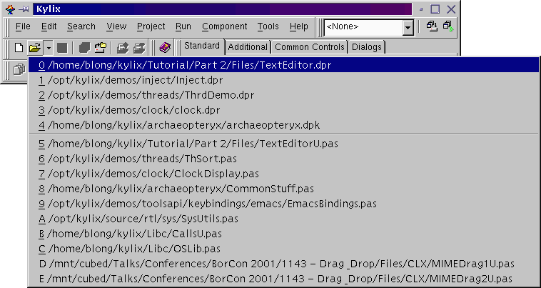
If you have not worked on the project recently, open it with File | Open Project..., or Ctrl+F11. If you have opened the project recently, you will find it in the history list (File | Reopen), but note that there are two sections to the list. The files at the top are project files (typically opened with File | Open Project...) and those at the bottom are units (typically opened with File | Open...) - in this case, we need to open a project, so choose the right file.
Before doing anything with the project, we perhaps should broach the idea of exceptions. CLX uses a rich error-handling model based around exceptions, which are programmatic representations of errors. Whenever any type of error occurs, an exception is raised. By default, the application automatically displays the exception in the form of a message dialog and, when the dialog is dismissed, the application carries on as normal. You can write custom error handling for any exceptions you choose, but even without this, the application handles errors gracefully.
We’ll leave coverage of custom exception handling until another time, but for now, let’s see how the Kylix IDE deals with application exceptions. Run the text editor application by pressing F9 (or choosing Run | Run). Choose File | Open... in the program and enter the name of a non-existent file (such as xyz), then press OK.
What happens next is the IDE pops up to the foreground with a message saying your program raised an EFOpenError exception, which has an associated message. It also says your process has been stopped and that you can either step it in the debugger, or allow it to continue running (see Figure 1).
Figure 1: The IDE reporting an application exception

The situation is thus: when you ran your application, the Kylix debugger started actively tracking it. When the debugger detected an exception being raised in your program, it immediately suspended it, just as if there were a breakpoint there.
If you were developing a real application with lots of code and you needed to debug an unexpected exception, this might be useful as the debugger will position you on the offending line of code in the editor. However, to newcomers to Kylix, this feature can be a bit confusing.
What you should do now is close the message box and press F9 again to let the program continue execution, which it will do by reporting the error itself - this is normal behaviour. You can continue using the program as normal now and then close it when you are done.
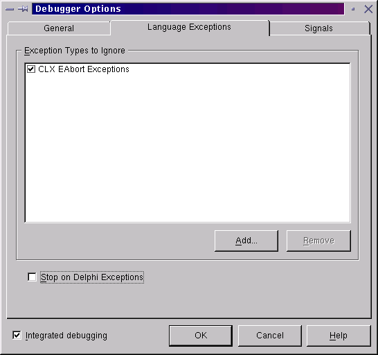
If you are happy with the debugger popping up every time there is an exception in your program, then fine. However, if you would prefer the debugger to remain silent on these occasions then we can tell it so. Choose Tools | Debugger Options... and on the Language Exceptions page of the dialog, uncheck the Stop on Delphi Exceptions checkbox (see Figure 2). We’ll ignore the product name faux pas there.
Figure 2: Telling the debugger to ignore application exceptions
The improvements we will make to the text editor application this month include adding a word wrap option (handy in text editor’s) and enhancing the UI with menu images, a toolbar supporting hot images, tooltips and a status bar displaying hint information.
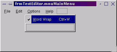
Let’s start with the word wrap option. Double-click on the menu component, mnuMainMenu, to get back the Menu Designer. Here we will insert an Options menu by selecting the Help menu in the Designer and pressing the Insert key (or right-clicking and selecting Insert). Give it a suitable caption and name, then click back on the Menu Designer and select the empty menu item below it. Give this item a name of mniWordWrap, a caption of &Word Wrap and a shortcut of Ctrl+W.
Now create an OnClick event handler for the item that will toggle the checkmark that can be associated with a menu item and set the memo’s WordWrap property accordingly.
procedure TfrmTextEditor.mniWordWrapClick(Sender: TObject);
begin
  mniWordWrap.Checked := not mniWordWrap.Checked;
  memText.WordWrap := mniWordWrap.Checked
end;
To finish the job, we should realise that word wrap is on by default, so you should set either the menu item’s Checked property to True (see Figure 3) or the memo’s WordWrap property to False, to match. You can also set the memo’s ScrollBars property to ssAutoBoth to ensure that if enough text is entered width-wise or height-wise, scrollbars will appear to help the user.
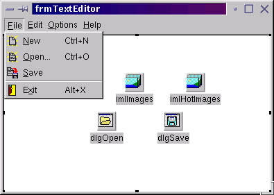
To get a visually enhanced menu with little images embedded to the left of each item, we need an image list component (from the Common Controls page of the component palette). Call it imlHotImages (we will see the significance of the term “hot” later) and connect the menu component’s Images property to it. This now allows the menu items to index into the image list and make use of the images therein. So, we now need to add some images.
When Kylix is installed, it includes a number of sample images for buttons, menus or whatever, installed in Kylix’s images directory. They actually look rather dated, as they are the same images that were supplied with Delphi 1 back in 1995, but since all Kylix installations have them, they will do for now
.Double-click the image list and it will invoke the associated editor that allows you to add new images (you can see it in Figure 6 and Figure 7). Press the Add... button and navigate to your Kylix installation directory, then into the images/buttons subdirectory. You can now choose a bitmap file to add to the image list. We recommend you add one image at a time to the image list, otherwise the image order will go wrong and we may get inappropriate images.
The first image is filenew.bmp (see Figure 4). When you look at it there are a couple of things to notice. Firstly, it has an unpleasant olive background (which becomes transparent when used in your program), and secondly the bitmap is actually made of two square images. The left image is a coloured version and the right image is a colourless version.
Figure 4: One of Kylix’s sample images (looking a bit of a mess)

All the images in this directory will share these attributes and you will find that when you add an image to the image list, it will ask you if you want to split the bitmap into two images (see Figure 5). You should accept all such offers. The full list of bitmaps for the menu items that will be decorated includes: filenew.bmp, fileopen.bmp, filesave.bmp, dooropen.bmp, cut.bmp, copy.bmp, paste.bmp, npadwrit.bmp (this one is not very appropriate but was the best I could find in the supplied bitmaps).
Figure 5: The image list editor asking a sensible question

When all are added, you end up with an image list with coloured and colourless versions of eight bitmaps (see Figure 6). Now we need to duplicate the image list component so, having selected the image list on the form designer, choose Edit | Copy and Edit | Paste, then name the new image list imlImages.
Figure 6: All the images have been added, both enabled and disabled
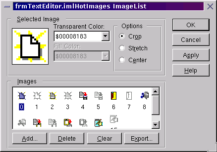
In the image list editor for imlHotImages, select each disabled image and delete it, then delete all the enabled images in imlImages. This leaves an image list of coloured, or “hot”, images and one of colourless images.
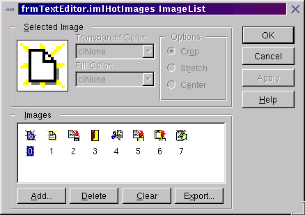
Now we can set up the images used by each menu item. Double-click the mnuMainMenu component and, in the Menu Designer, select each menu item that should be given an image and set its ImageIndex property to the corresponding image index (which can be browsed in the image list editor, as shown in Figure 7). Now the application menu looks much more professional (see Figure 8), although we have not yet made use of the colourless images.
Figure 8: The menu looking more colourful
You can find a status bar component on the Common Controls page of the Component Palette. Drop one of these on your form (calling it sbInfo) and it will stick to the bottom of the form because its Align property defaults to alBottom. The Kylix editor uses a status bar component to display several pieces of information such as the cursor location, whether the file is modified and whether you are in insert or overwrite mode. Each piece of information is displayed in a separate status panel on the status bar.
To add status panels to your status bar, you use the status panel collection editor, which can be invoked by double-clicking the status bar or invoking the property editor for the Panels property. Press the collection editor’s yellow button (or the Insert key) twice and you will have two status panels, each represented as an object.
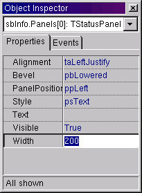
When either status panel is selected in the collection editor, the Object Inspector shows its property values (see Figure 9). The instance list at the top of the Object Inspector also informs you of the syntax required to refer to this particular status panel object. Figure 9 shows the first status panel selected, which can be referred to as sbInfo.Panels[0]. Change the width of this status panel to 200 pixels (it defaults to 50).
Figure 9: Properties of an area on a status bar
This first panel will be used to display hint information about items under the mouse cursor (such as menu items and, later, toolbuttons). This happens automatically if you set the status bar’s AutoHint property to True. To test this out, go back to as many menu items as you like in the Menu Designer (or simply select them with the Object Inspector’s instance list) and enter a descriptive string for the Hint property.
Next, we should use the second panel for something, perhaps to display the date and time. Since this will need to be updated at least every second a timer component from the Component Palette’s Additional page should be used. Give it a name of timClock and an Interval of 250 (this is measured in milliseconds, so represents 1/4 second). Every quarter of a second the OnTimer event will execute, so make an event handler for OnTimer (you can double-click on the timer component on the Form Designer to achieve this) and enter this code.
procedure TfrmTextEditor.timClockTimer(Sender: TObject);
begin
  sbInfo.Panels[1].Text := FormatDateTime(
    'h:nn:ss am/pm "on" ddd, d mmm, yyy', Now)
end;
This calls the BaseCLX routine Now, which returns the date and time as a TDateTime value, and passes it to FormatDateTime to generate a custom string representation of it based on simple substitution of known character sequences (you can find more information on both of these routines in the Kylix help). Notice that the word on is an arbitrary word we want in the result, so it is enclosed in double quote characters to prevent substitution of any of its characters, such as “n”.
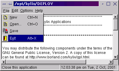
Now run the program and see the results. Figure 10 shows the status bar displaying the hint for the selected File | Exit menu item, as well as the date and time.
Figure 10: Automatic hint display on a status bar
The next improvement will be to add a toolbar component, which can be found on the Palette’s Common Controls page. This will automatically migrate to the top of the form thanks to its Align property defaulting to alTop. Change the name to tbMainToolBar, set Flat to True (this gives the effect of a completely flat toolbar, like those in Kylix, whose buttons become 3D as the mouse moves over them), ShowCaptions to True (the toolbuttons on the toolbar can show a caption as well as a picture) and AutoSize to True.
A right-click on the toolbar reveals two new menu items: New Button and New Separator. Add as many buttons as you wish (each one will be a shortcut for a menu item), separating items from different menus with separators. For each toolbutton, the behaviour it needs to invoke has already been implemented last month in menu item OnClick event handlers.
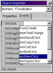
A nice feature of Kylix is that we can typically share event handlers between different events of different components, unless the expected event handlers have incompatible parameter lists. So rather than making a new event handler for each toolbutton, we can connect its OnClick event to an existing event handler by choosing a suitable one from the list (see Figure 11).
Figure 11: An excellent opportunity for code reuse
A nice feature of Kylix is that we can typically share event handlers between different events of different components, unless the expected event handlers have incompatible parameter lists. So rather than making a new event handler for each toolbutton, we can connect its OnClick event to an existing event handler by choosing a suitable one from the list (see Figure 11).
The sample project TextEditor2.dpr has toolbuttons with the following properties (we’ve ignored the separators in this list):
Name=tbnNew,	 Caption=New,	 OnClick=mniNewClick
Name=tbnOpen,	 Caption=Open,	 OnClick=mniOpenClick
Name=tbnSave,	 Caption=Save,	 OnClick=mniSaveClick
Name=tbnCut,	 Caption=Cut,	 OnClick=mniCutClick
Name=tbnCopy,	 Caption=Copy,	 OnClick=mniCopyClick
Name=tbnPaste,	 Caption=Paste,	 OnClick=mniPasteClick
Name=tbnWordWrap,	 Caption=Wrap,	 OnClick=mniWordWrapClick
Some final touches are necessary to finish the job off. For example, the Word Wrap toolbutton needs to either be up or down to reflect the state of the memo’s WordWrap property. To allow it to be toggled up and down set its Grouped property to True, and then set Down to True (assuming you left the memo’s WordWrap set to True earlier).
Now we can ask the toolbuttons on the toolbar to use the images in the image lists we set up earlier. Connect the toolbar’s Images property to imlImages and its HotImages property to imlHotImages. Many toolbars will only use an Images property, to provide the images required by the toolbuttons.
The HotImages property provides an extra feature whereby as the mouse moves over a toolbutton, its image is replaced by the corresponding hot image, to accentuate the fact that it is available and under the mouse. Hot images are supposed to help the user follow what is going on. We already set the Flat property earlier, meaning the flat toolbutton becomes 3D as the mouse moves over it, but with the HotImages property set as we have, the toolbutton also changes from having a colourless image to a colourful image.
The last item on the agenda for this month is to get some tooltips showing for the toolbuttons. We already have control hints being displayed automatically in the status bar, but we can also have real tooltips (popup hint windows) if we choose.
Every control that can display a tooltip has a ShowHint property, which defaults to False. If you set the form’s ShowHint property to True, it will propagate down through all the child controls on the form (thanks to the common ParentShowHint property defaulting to True). This is the first step.
The next thing to do is to give each toolbutton a descriptive tooltip string to display (this is again controlled by the Hint property). However, if you think about it (or indeed test it), this will cause the hint string to be displayed twice for every toolbutton, once in the status bar and once in a tooltip.
To improve upon this situation, the Hint property of any control can optionally contain two strings, separated by a pipe sign. For example, the Open toolbutton in the supplied version of this project has a Hint property of:
Open file|Open an existing document
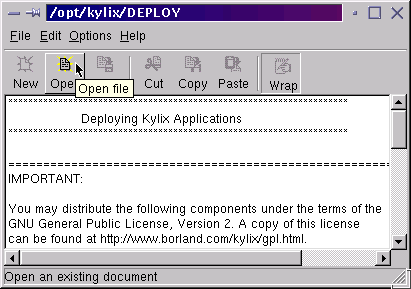
The status bar displays the second (typically lengthier) string, whilst the tooltip displays the first string. You can see the final version of the program running in Figure 12, showing a tooltip, a status bar hint and also the Open toolbutton’s hot image.
Figure 12: Toolbars, menu images, tooltips, status bars and hints... what more do you want?
You will find that many menu items use function key shortcuts in Kylix, for example File | Open Project... is Ctrl+F11, View | Project Manager is Ctrl+Alt+F11, Project | Compile project is Ctrl+F9, and so on. However, most users find that their X window manager will swallow all the keystrokes involving function keys, meaning Kylix never sees them. Whilst using Kylix, you can stop this happening by turning on the Scroll Lock button on your keyboard. The window manager will now ignore all these keystrokes, but Kylix successfully picks them up. If you need to use other Linux applications, you can always turn Scroll Lock back off.
Whilst running applications from the Kylix IDE, you can prevent the Open Edition splash screen from appearing by specifying the -ns command-line argument to your application. To do, this choose Run | Parameters... and enter -ns in the Parameters entry.
If you lose track of a given window in the IDE, you can use View | Window List (or Alt+0) to get it back. This shows a list of all windows open, showing the caption of each one. As long as you have a good idea of the caption of the window you lost, this makes it trivial to resurface it.
You get the same menu obtained through File | Reopen by clicking the little arrow immediately to the right of the File | Open... toolbutton (see Figure 13).
Figure 13: A quick way of getting the recent file list
To switch back and forth between a form unit and the corresponding form designer, use the F12 keystroke (a shortcut for View | Toggle Form/Unit).
To locate a source file that is part of your project, be it a unit or the project file, choose View | Units... (Ctrl+F12).
To locate a form or data module that is part of your project, choose View | Forms... (Shift+F12).
There are a number of options in the Kylix IDE that, in our opinion, can provide a slightly better development experience. Here are some of them:
Editor auto-save: invoke the Tools | Environment Options... dialog (see Figure 14) and, on the Preferences page, enable the Editor files option in the Autosave options group. This will cause the IDE to automatically save all changes to your project files just before it launches your executable (every time you press F9, or choose Run | Run). This way, you know that your changes are saved each time you test your application's run-time behaviour. You can also check the Desktop option here, which causes Delphi to record the position and size of all its IDE windows, and which files were open in the editor. This information is stored in a text file with the same name as the project and a .dsk extension.
Figure 14: The environment options dialog with some useful settings
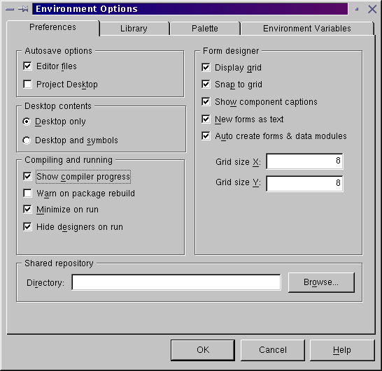
Non-visual component captions: on the Preferences page of the environment options dialog, turn on the Show component captions option in the Form Designer group and any non-visual components on any Form Designers will have their Name property written below their image. This option is off by default because Borland prefer you to place non-visual components on Data Modules (very much like forms, but with no run-time user interface).
Minimise on run: on the Preferences page of the environment
options dialog, turn on the Minimize
on run option in the Compiling
and running group. Now, each time you launch an application from
the Kylix, the IDE will obligingly minimise itself, to keep the screen relatively
clear. After having tested your application, when you close it Kylix will
obediently restore itself again for your use.
The environment options dialog Preferences page can be seen in Figure
14, where you will also see an option to display the progress of Kylix
compilations. Note that unless you have a large project, there is not much
to see - Kylix compiles at a metaphorically blinding speed.
Enhanced editor undo: The Kylix Form Designer is very backward in its Undo behaviour. If you delete a component, you can undo the deletion but that's about it. On the other hand, the code editor has great undo capabilities, being able to undo up to 32,767 successive operations by the programmer. However, the default behaviour is that each time you save a file, the undo buffer is emptied, which means you can't undo past your last saved point. Given the recommendation of the auto-save option above, this means that each time you run your application the undo buffer is cleared. This clearing-on-save behaviour can be remedied by choosing Tools | Editor Options... and, on the General page, enabling the Undo after save option.
We have seen the UI of our text editor application coming on in leaps and bounds, due to the rich components and properties available in the CLX library. However, there are still areas that warrant improving.
For example, if we want to have the toolbar and menu system context-sensitive, where buttons/items are only enabled when they are relevant, things can be a bit tricky. Every time something happens in the program, we will need to disable or enable both the menu item and the toolbutton (and any other controls that can invoke the same behaviour).
Next time we will look at actions, which are CLX objects that are specifically designed to improve exactly this situation.
Before finishing, I should mention that everything we have done so far with Kylix Open Edition and practically everything you can do with it can also be done with Delphi, Borland's commercial application development systems for Microsoft Windows. Delphi 6 Enterprise Edition is a product comparable to Kylix 1 Server Developer and Kylix 2 Enterprise Edition, Delphi 6 Professional Edition is comparable to Kylix 1 Desktop Developer and Kylix 2 Professional Edition, and Delphi 6 Personal Edition is similar to Kylix 1 and 2 Open Edition, but does not permit the generation of GPL applications and does not permit then distribution of applications.
You can take our Kylix projects, load them directly into Delphi and run them as Windows applications due to the source-level cross-platform nature of the CLX component library.
Brian Long used to work at Borland UK, performing a number of duties including Technical Support on all the programming tools. Since leaving in 1995, Brian has spent the intervening years as a trainer, trouble-shooter and mentor focusing on the use of the C#, Delphi and C++ languages, and of the Win32 and .NET platforms. In his spare time Brian actively researches and employs strategies for the convenient identification, isolation and removal of malware.
If you need training in these areas or need solutions to problems you have with them, please get in touch or visit Brian's Web site.
Brian authored a Borland Pascal problem-solving book in 1994 and occasionally acts as a Technical Editor for Wiley (previously Sybex); he was the Technical Editor for
Mastering Delphi 7
and
Mastering Delphi 2005
and also contributed a chapter to Delphi for .NET Developer Guide
.
Brian is a regular columnist in The
Delphi Magazine and has had numerous articles published in Developer's Review,
Computing, Delphi Developer's Journal
and EXE Magazine. He was nominated for the Spirit
of Delphi 2000 award.